2018 has been an interesting year for the equities market as:
- This year the P/E of NIFTY has been above 26 and has even been higher than 28. Historically the P/E of the market has never been above 26 for more than a couple of months. High P/E periods were usually followed by a large correction.
- Corporate earnings growth has been much lower than the historical averages though a slight improvement has been witnessed recently, it can’t call it a trend yet.
- Many companies have had significant correction, but NIFTY continued its march upwards since Jan 2018.
This calls for a deep dive into the data to get a better perspective. This analysis is to understand the current trends from an historical perspective.
Data about data:
- Data used for this is from 01 Jan 2001 to 21 Sept 2018.
- This is an analysis of the percentage change in the stock price of each company from the year beginning to year end and comparing it with the percentage change in the Index for the same period.
- Market capitalization for the year is the average of month end market capitalizations for the year.
- Companies have been classified into various categories based on their average of market capitalization of all the companies.
- “A” is the average of market capitalization of all the companies for the year.
- A-3A is the group of companies that have market capitalization between average and 3 times the average for that year.
- GT25A is all the companies that have market capitalization more than 25 times the average for that year.
- Performance of the category vs the Index is an average of the performance of companies in the category weighted by market capitalization of the company vs the Index.
Observations from the analysis:
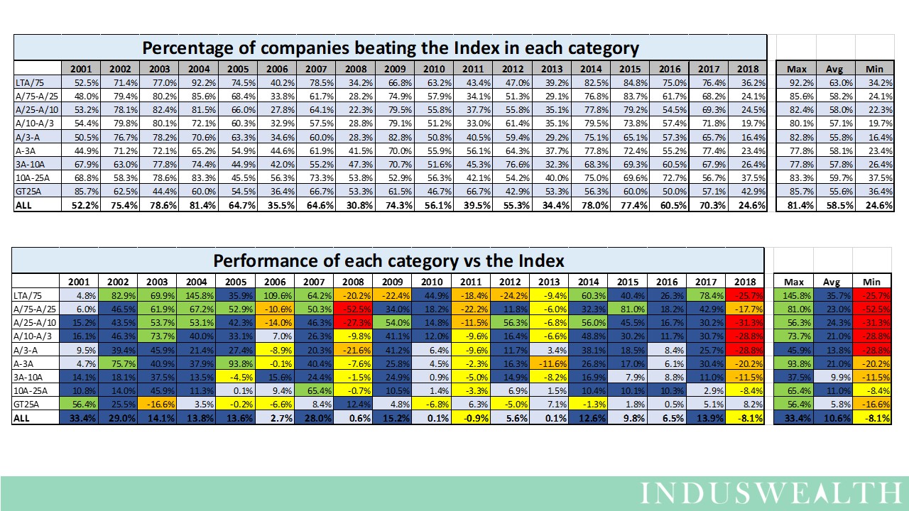
- Usually 55% of the companies do better than the index (falling less than the index is also counted as doing better than the index)
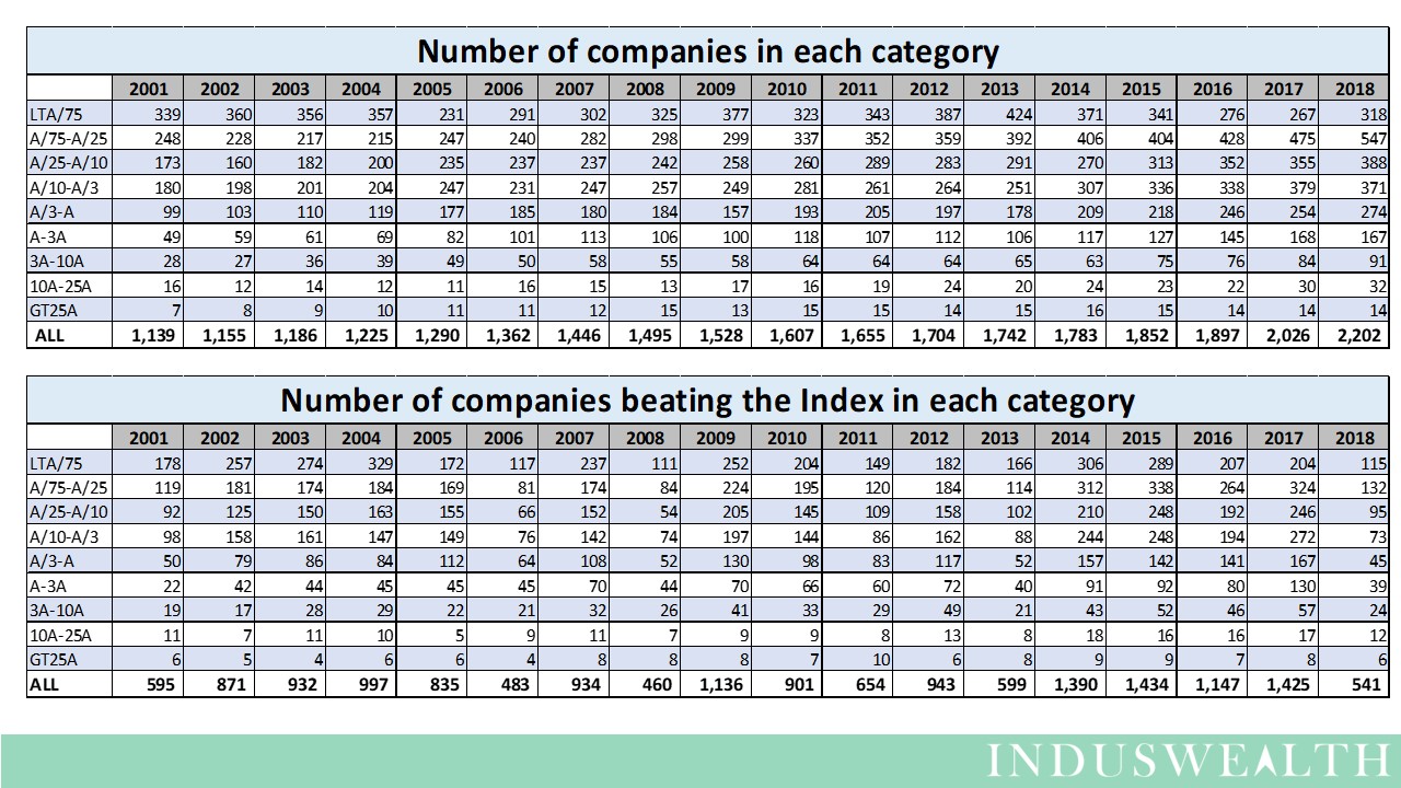
- 2018 has been unique in the sense that only 24.6% of the companies have done better than the Index – This is the lowest in the last 18 years.
- Even in 2008 it was 30.8% of the companies did better than the Index, 2013 it was 34.4%, 2006 it was 35.5%, and in 2011 is was 39.5%.
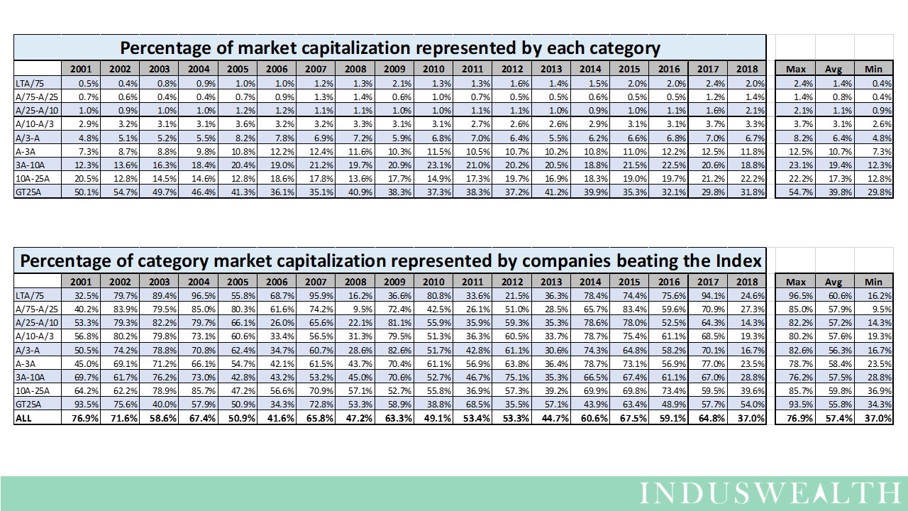
- Usually 55% of the total market capitalization does better than the index (falling less than the index is also counted as doing better than the index)
- 2018 has been unique in the sense that only 37% of the total market capitalization has done better than the Index – This is the lowest in the last 18 years.
- Even in 2008 it was 47.2% of the market capitalization did better than the Index, 2013 it was 44.7%, and in 2006 it was 41.6%. All other years it was over 50%.
- When we compare performance of all the companies vs the Index, it shows that most of the time it is positive, i.e., many companies do slightly better than the Index (even if the index falls they fall slightly less).
- 2018 has been a major exception where the average of performance of all companies vs Index is 8% below the Index – this is the lowest in the last 18 years.
- 2011 is the only other time where average of performance of all companies vs Index was negative, it was 1% below the Index.
- In the years where the market does well most categories also tend to beat the Index and in year’s when the markets fall most categories do poorly vs the Index, usually GT25A is the only category that can be expected to better than the index when the overall market falls.
- In 2018, GT25A has been the only category which has beaten the Index. (6 out of the 14 companies in this category have beaten the index). All the other categories have lost to the Index.
- This is pattern is very similar to 2008, 2011, 2013 and 2006.
- In 2018 all categories other than GT25A and A/75 – A/25 have had their worst performance vs the Index in the last 18 years.
Inferences from this analysis
- We can say that the current market is having a narrow rally as the overall index level is being sustained by very few companies.
- We can also say that the current market is having a broad crash as 63% of the market cap or 75.4% of the companies are doing worse than the Index and this difference is the highest seen in the last 18 years. And this pattern is similar to earlier crashes.
There are some pundits who have been calling this a narrow rally. We haven’t seen the term “broad crash” being used publicly so far, but the data here says that the case can be made. It tastes like a crash, smells like a crash, but does not look like a classical crash.
We hope that this article will help you make up your mind.
Happy Investing….


